When I was working at Planet one of the more impactful tasks I did was a from-scratch rework of the groundstation ansible repository. We originally ran a classic structure with task based roles like network-configuration or data-transfer. The catch was our fleet wasn’t really cattle, we serviced multiple satellite constellations using multiple satellite dish models in multiple ways. This web of complexity and different combinations exposed itself in each role where it was handled in different ways. The complexity meant that a change to a variable could ripple out to many roles, the whole system was fragile and inhibited us doing what we needed to do.
The new system we migrated to pulled all of that complexity up to the top level. We had a roles such as constellation A high speed data that did the network configuration, set up the data transfer, and everything else required. The roles were logically simpler, there were no longer functionality branches, but they also did much more. To handle that much more I came up with filedrop.
The filedrop I created for Planet is simultaneously the best and worst Ansible code I have ever written. It takes a tree of directories, files and templates and transfers them to the destination system. It also has fine grained permission and notifications using a regex, which allows things like any files transferred to /etc/ssh/ will be owned by root and only root writable, and if any of the ssh files change it will trigger a restart of the ssh service, but not if the non-ssh files change. It’s a role, pure yaml, about eight ansible tasks but about 100 lines long with horrendous variable manipulation and any attempts to debug it required copying a line out and exploding it into debug statements to track what it was actually doing.
For the benefit of humanity that version of filedrop is safely locked away on Planet’s servers. However I always thought I could do better by building a proper module. Something that could actually be debugged, was reliable enough for others to use and was less embarrassing to put my name to.
It is a proper ansible role, written in python with readable code, comments, and nice logic, it even has tests. It still orchestrates ansible copy actions under the hood, but it is something that I would be comfortable using in the future, and having others use.
Leave several hours or overnight
Drain the liquid, keep both the fruit and liquid parts
2. Milk mixture
In a small pot place:
300g milk
Bring to a light boil, then remove from heat
Add to the milk pot:
50g butter
Cool to 40°C before use, should feel warm to touch
3. Spice mixture
I’ve done a few different spice mixtures, they all come across very different, but all lovely. There’s a lot of flexibility to vary the spice mix and tune the flavour to your own preferences.
Option 1 - boring spicing:
1 tsp of cinnamon
Option 2 - heavily spiced:
1/2 tsp of cinnamon
1/2 tsp of allspice
1/2 tsp of nutmeg
1/2 tsp of cloves
1/2 tsp of ginger
Option 3 - no spice:
I once forgot the spice and it actually turned out really well.
Without the spice the fruit really shines through and has a great clean flavour.
4. Mix
In a stand mixer bowl place:
500g bread flour
5g (1 tsp) salt
75g caster sugar
7g (2 tsp) instant yeast
1 egg, beaten
milk mixture
Note place the salt and sugar on one side of the bowl and the yeast on the other side. Yeast is alive and resting on pure salt or sugar will kill it.
Kneed for approximately eight minutes, until a window forms
Transfer to an oiled bowl
5. Proof and add flavour
Place dough somewhere warm to rise for one hour, should double in size
To dough bowl add:
Soaked fruit
Spice mixture
1 medium sized green apple, peeled and diced
Fold until incorporated.
6. Proof and form
Rise for one hour
Form 75g buns
Place each bun in a high sided tray, sitting close
Proof for one hour
Preheat oven, 200°C fan forced
If you have a baking tile put it in, it helps the bottom cook better.
7. Cross decoration
In a small bowl mix:
75g flour
5 tbsp water
This should form a thick paste
Pipe the paste onto the buns to form crosses
8. Bake
Place in oven, bake for 20 minutes
9. Glaze
In a small pot place:
Soaked fruit liquid
Reduce on stove to a thick glazing consistency
Glaze while buns are hot
Logic
Soaking
Dried fruit will pull moisture in to rehydrate itself. If you don’t soak it in advance it pulls that moisture from the dough upsetting the texture.
I feel the dried peel is very important. The great travesty of commercial hot cross buns is that most of them have moved away from peel, frankly it is the main reason I bake my own. The orange zest further ups the peel flavour without adding volume.
A longer soak pulls some of the sugar out and prepares for a fantastic glaze.
Milk stage
Scalding the milk is a standard bread technique. It denatures the whey proteins in the milk, this makes the milk more accessible to the yeast. Not doing this step prevents or slows the yeast growth.
The subsequent cooling is to prevent the heat killing the yeast when they are mixed together.
Adding the butter here is just convenient.
Mix
The mix recipe dough is basically a standard sweet bread recipe, I think I might have amalgamated two I found. The window forming is a standard bread making test, you pull the dough, if it thins to a slightly transparent window then it is done, if it tears first it needs more kneading.
Proof and add flavour
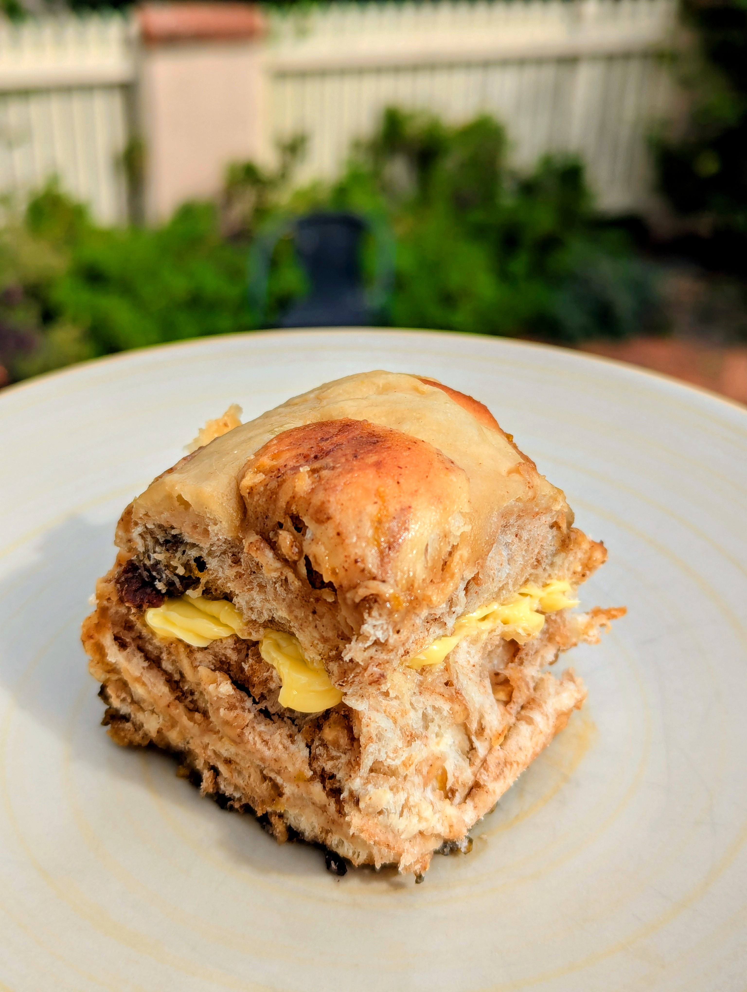
My goal with this recipe was to shove as much fruit in there as I could. I believe fruit is a bit expensive, more expensive than flour at least, which is why commercial bakeries all are light on the fruit.
However just slamming dried fruit in there turns out to be overwhelming and far too sweet, which is why I use the apple. The diced apple essentially disappears, nobody notices that apple is there. It doesn’t directly contribute flavour or colour, I feel it mellows out the overall flavour profile. Texturally though it is lovely, it feels like fruit, so you identify it as such while eating it, it also adds some freshness.
Doing this after the first rise means the dough has more strength to better carry more fruit. It also makes the spice a little inconsistent, you get interesting streaks rather than a constant even flavour.
Proof and form
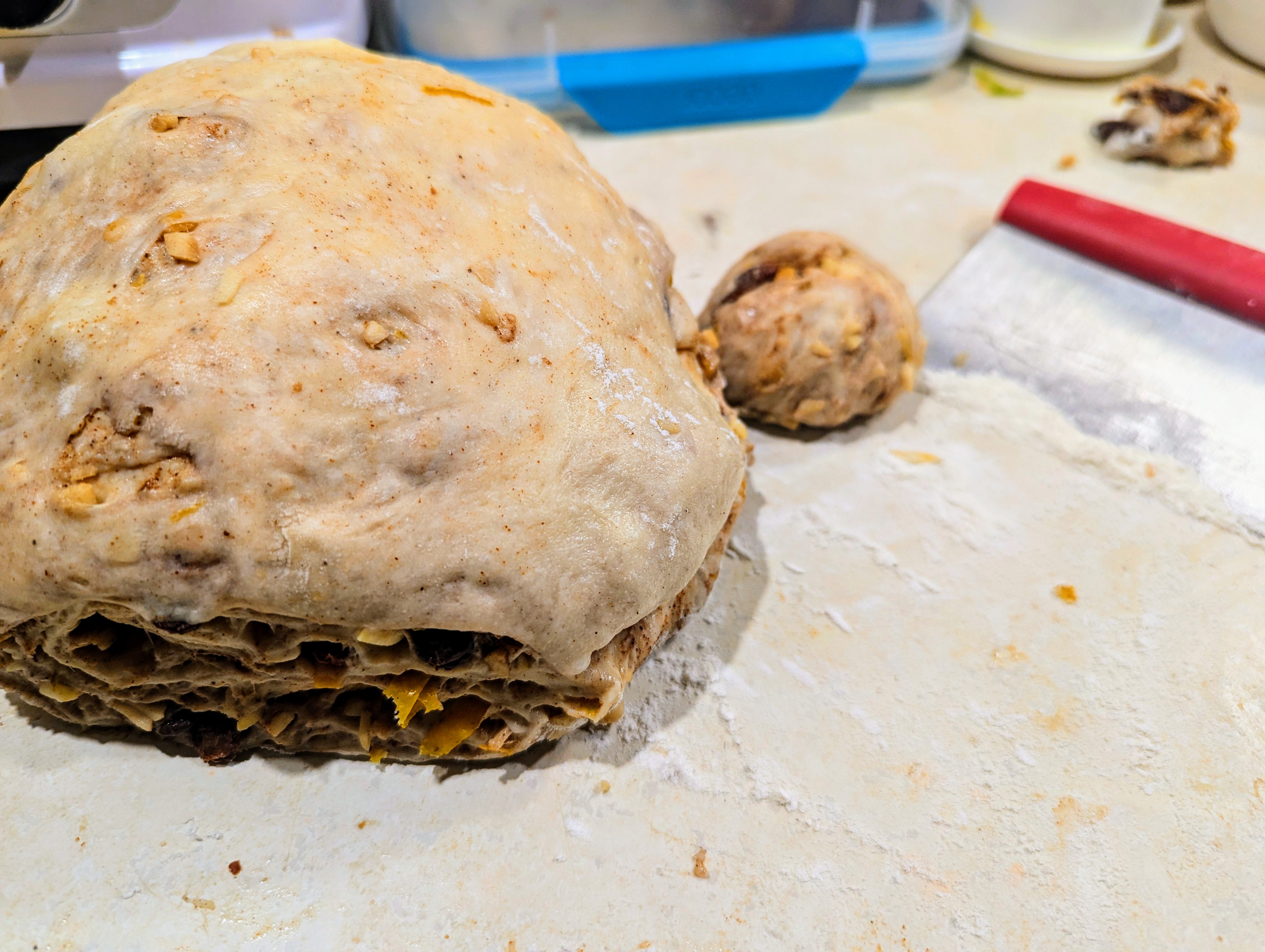
Shaping the bread properly is important, it gives structure to the bread, creates the good strong crust and allows more advanced crust shaping techniques. It also seems to be the step most neglected by home bakers.
There is a standard technique to rolling a bread bun or roll, the same technique works for hot cross buns. I encourage looking at a few guides and it takes some practice to get right, the amount of fruit makes also it harder. The chef who taught me could do two at a time, one in each hand, the bastard.
Using the soak liquid for the glaze solidifies the orange flavour into the buns.
The peel and zest means that the soak liquid is packed full of orange flavour, and sugar. Using it for the glaze reinforces that flavour back into the bun.
This is my full eleventy.config.mjs, which shows this code integrated with a pile of other stuff. It’s sort of awful but it may help as an example.
Disclaimer: My javascript is very rusty, my eleventy knowledge is slim, and I just wanted to cobble something together without having to do work. I’m sure someone could do better, I just couldn’t find it to crib from.
Outstanding Issues:
I have two copies of the full original image
It’s a bit messy
The full image link is a touch ugly, could add a nicer html viewer
The caption isn’t linked, I initially thought it should be, now I’m less sure
SVG images don’t work, but I don’t think that is related
Alternatives:
I could change the eleventy-img naming scheme to not use a hash, which would allow me to link to a predictable name. But the markdown-it-image-figures library doesn’t have a method to feed in a custom name.
I could use the eleventy-img name generator to get the full size name and wrap my own link. But that would involve writing code.
There are also so very many alternative image libraries, a different mix could be used.
I could also extract the title attribute from the image to generate the caption, either with an eleventy transformation step or in client side javascript.
Detailed introduction
This new blog runs Eleventy (https://www.11ty.dev/). I previously used Wordpress and wanted to try something different, the online consensus seemed to be that eleventy was the bee’s knees.
This was a mistake. I would not recommend eleventy to anyone wanting to start a blog. I got it working to a level that I’m mostly satisfied by and publishing with a git push is kinda cool. But it was a complete pain to set up and took a considerable period of time and effort. If you just want a blog then use Wordpress. If you want to play around solving complex technical problems for a few days, then eleventy is great.
Eleventy’s blessing and curse is that it is hugely customisable. There are so many different ways to do it, the project is even alternatively referred to as Eleventy or 11ty in different places.
Because there are so many ways to do things it is very hard to do anything easily. Even using examples is messy because they layer so deeply. I decided to use the Eleventy Classic Blog Starter as my initial template, it’s reasonably good, got me started though I increasingly customized it as I went. I found another example that I tried to lift portions of but failed. Because the template I chose used nunjucks as the templating language and the second used liquid as the templating language and the two can’t interoperate, at least I couldn’t get them to do so. So I had to actually write code rather than copy/paste 😦.
This multiple ways of doing things is everywhere, so stitching together examples is increasingly perilous. Even the official documentation provides examples in both the CommonJS and ESM syntax, other places online use either one, I’m fairly sure I’m using both in my system because I have no idea what I’m doing. Using eleventy increasingly forced me to learn modern Javascript, which may not be a bad idea, but wasn’t my goal.
I’m normally a fan of multiple approaches, as a frustrated Perl programmer TMTOWTDI was my mantra. I’m sure if my Javascript was solid and up to date I would have understood the nuances of the code I was attempting to copy/paste and it would have been far less of an issue. It’s just I wanted to restart my blog, not relearn Javascript.
Fundamentals
Eleventy is a template orchestration system.
It’s basically template agnostic, anything that will generate html is great. In our cut down example we are using markdown and nunjucks. The eleventy docs list 11 different supported template systems, plus variants like Javascript supporting JSX and Typescript. It’s plugin based though, and a npm search for eleventy-plugin gives over 1000 results, which is when npm stops bothering to count.
Templates can be nested and intertwine. For example our markdown content is wrapped in a nunjucks layout template. Eleventy has a clever data cascade to manage this, it is poorly documented in their docs.
Templating itself can also be complex. The markdown processing is done by markdown-it, which seems to be the Javascript standard library. This library also has a plugin system for syntax extensions, so each plugin can hook at different points to morph the markdown or intermediate html.
Once the templating is done we have a collection html documents. Then there is a transformation stage, a series of transformations, typically from plugins is supplied.
(I suspect eleventy can probably be tweaked to generate non-html documents, it feels like that kind of system, but that’s another layer of complication I don’t want to go anywhere near.)
Image transformation data flow
We are going to transform an example image from (weekly-wrap-11-17-april)[/weekly-wrap-11-17-april/]
The original line is in markdown.

The rough desired outcome is
<ahref="./butterhorns.jpg"><figure><imgalt="Crumbly biscuits in a paper lined container"src="./butterhorns.jpg"loading="lazy"srcset="..."sizes="auto"/><figcaption>Delicious butterhorns</figcaption></figure></a>
I’m going to introduce the steps in an iterative order because it makes more sense to build up the layers. I’ll summarise with the final sequential data flow.
Markdown processing
Basic first step, we want to introduce markdown-it to convert the markdown to html.
<imgsrc="./butterhorns.jpg"alt="Crumbly biscuits in a paper lined container"title="Delicious butterhorns">
Image processing
Second we introduce eleventy-img. There are a lot of image processing alternatives for eleventy, when I did a google search I got about six decent options I reviewed, every single one of them was based around a different library.
The initial starter I chose used markdown-it-eleventy-img, which was ok. I switched to @11ty/eleventy-img as it seemed like the newer recommended and officially supported option. It actually turned out that markdown-it-eleventy-img was calling @11ty/eleventy-img from the markdown processing stage, I switched to using a eleventy-img supplied hook to call it from the transformation stage.
@11ty/eleventy-img runs after templating and searches for img tags. It takes the image files specified and converts them into different desired formats and sizes. It then rewrites the img tag to have the srcset list of different generated sizes, this allows the browser to choose the best image. It also adds a picture tag layer for multiple format selection by the browser if required.
This plugin basically gives you responsive images very easily.
One downside is that it changes the filename in the process.
(As a side note one of the reasons why the examples on the page are in iframes is because if I inline the html in the markdown then eleventy-img will find and transform the image tags. I could exempt them with an eleventy:ignore attribute but iframes provide more confidence.)
import markdownit from'markdown-it';
import { eleventyImageTransformPlugin } from'@11ty/eleventy-img';
exportdefaultasyncfunction(eleventyConfig) {
constMarkdown = markdownit();
eleventyConfig.setLibrary('md', Markdown);
eleventyConfig.addPlugin(eleventyImageTransformPlugin, {
extensions: 'html', // which file extensions to processformats: ['jpeg', 'webp'], // output image formatswidths: ['auto', 400], // output image widthsdefaultAttributes: { // extra attributes for <img>loading: 'lazy',
decoding: 'async',
},
transformOnRequest: false// make dev look like prod for examples, you probably don't want this
});
return {
templateFormats: ['md', 'njk'],
markdownTemplateEngine: 'njk',
dir: {
input: './site',
output: './public'
}
};
};
<divrole="main"class="content container"><p><picture><sourcetype="image/webp"srcset="/img/QPKmYeJmdi-400.webp 400w, /img/QPKmYeJmdi-1024.webp 1024w"sizes="auto"><imgsrc="/img/QPKmYeJmdi-400.jpeg"loading="lazy"decoding="async"alt="Crumbly biscuits in a paper lined container"title="Delicious butterhorns"width="1024"height="747"srcset="/img/QPKmYeJmdi-400.jpeg 400w, /img/QPKmYeJmdi-1024.jpeg 1024w"sizes="auto"></picture></p>
Figure layer
To wrap the generated image in a figure we use the markdown-it-image-figures plugin. This modifies the markdown stream to wrap the image in a figure and add the title as the figure caption.
The other processing occurs on the tags within the figure, so @11ty/eleventy-img is fine.
import markdownit from'markdown-it';
import markdownit_imagefigures from'markdown-it-image-figures';
import { eleventyImageTransformPlugin } from'@11ty/eleventy-img';
exportdefaultasyncfunction(eleventyConfig) {
constMarkdown = markdownit()
.use(markdownit_imagefigures, {
figcaption: "title",
});
eleventyConfig.setLibrary('md', Markdown);
eleventyConfig.addPlugin(eleventyImageTransformPlugin, {
extensions: 'html', // which file extensions to processformats: ['jpeg', 'webp'], // output image formatswidths: ['auto', 400], // output image widthsdefaultAttributes: { // extra attributes for <img>loading: 'lazy',
decoding: 'async',
},
transformOnRequest: false// make dev look like prod for examples, you probably don't want this
});
return {
templateFormats: ['md', 'njk'],
markdownTemplateEngine: 'njk',
dir: {
input: './site',
output: './public'
}
};
};
<figure><picture><sourcetype="image/webp"srcset="/img/QPKmYeJmdi-400.webp 400w, /img/QPKmYeJmdi-1024.webp 1024w"sizes="auto"><imgsrc="/img/QPKmYeJmdi-400.jpeg"loading="lazy"decoding="async"alt="Crumbly biscuits in a paper lined container"width="1024"height="747"srcset="/img/QPKmYeJmdi-400.jpeg 400w, /img/QPKmYeJmdi-1024.jpeg 1024w"sizes="auto"
></picture><figcaption>Delicious butterhorns</figcaption></figure>
Full image link
I want to be able to have a user click on the image to get the full sized original version, rather than whatever size has been chosen for their viewport.
The catch is the filename for that full sized image is generated by @11ty/eleventy-img, so I don’t know what it is without some fiddling. And eleventy-img doesn’t have a config option to just give me a link. The eleventy-img file is also probably a different file format, where I want to link to the original.
So I added a passthrough config to copy the images through to the final output. The file is unchanged, as is the filename and path. So the filename specified in the original markdown line exists on the server.
Having done this I could set the link config option for markdown-it-image-figures. This adds a link wrapper to the image using the filename as specified in the markdown. The link is unchanged by @11ty/eleventy-img so it needs the original images to be passed through to work.
import markdownit from'markdown-it';
import markdownit_imagefigures from'markdown-it-image-figures';
import { eleventyImageTransformPlugin } from'@11ty/eleventy-img';
exportdefaultasyncfunction(eleventyConfig) {
constMarkdown = markdownit()
.use(markdownit_imagefigures, {
figcaption: "title",
link: true, // links to the passthrough version of the image
});
eleventyConfig.setLibrary('md', Markdown);
eleventyConfig.addPlugin(eleventyImageTransformPlugin, {
extensions: 'html', // which file extensions to processformats: ['jpeg', 'webp'], // output image formatswidths: ['auto', 400], // output image widthsdefaultAttributes: { // extra attributes for <img>loading: 'lazy',
decoding: 'async',
},
transformOnRequest: false// make dev look like prod for examples, you probably don't want this
});
// pass through original images, for full sized links
eleventyConfig.addPassthroughCopy("site/**/*.jpg");
eleventyConfig.addPassthroughCopy("site/**/*.png");
eleventyConfig.addPassthroughCopy("site/**/*.svg");
return {
templateFormats: ['md', 'njk'],
markdownTemplateEngine: 'njk',
dir: {
input: './site',
output: './public'
}
};
};
<figure><ahref="/butterhorns.jpg"><picture><sourcetype="image/webp"srcset="/img/QPKmYeJmdi-400.webp 400w, /img/QPKmYeJmdi-1024.webp 1024w"sizes="auto"><imgloading="lazy"decoding="async"width="1024"height="747"alt="Crumbly biscuits in a paper lined container"src="/img/QPKmYeJmdi-400.jpeg"srcset="/img/QPKmYeJmdi-400.jpeg 400w, /img/QPKmYeJmdi-1024.jpeg 1024w"sizes="auto"
></picture></a><figcaption>Delicious butterhorns</figcaption></figure>
When I got to the end of putting together this blog it was looking a little bare, I felt in needed a nice photo. Not being able to decide on the photo to use, I thought a random photo from an album would be better… because choosing a album’ss worth of images would somehow be easier (I consider the current photos placeholders, because I still haven’t solved the actual original problem).
Rather than self hosting this I, for some reason (probably because 11ty images are fiddly and annoying), decided to go with Flickr. Flickr turned out to work really well.
For the first draft I decided to give AI another go.
I’ve previously tried AI (ChatGPT and Claude) for Ansible and Python development work and found it underwhelming. But a friend and various random strangers online keep talking about how wonderful it is, and it had been a fair while since I last gave them a shot.
It was surprisingly good. Claude supplies a kinda-live development environment with sourcecode and finished webpage tabs that you can switch between. You can also highlight lines and say “explain” or “change this”. It was limited by not being able to actually connect the flickr API so I couldn’t iterate with the system. I think this is Claude setting the connect-src Content-Security-Policy, probably to prevent running third party scripts that completely compromise your session.
Initially the system didn’t work because it was missing the user_id parameter. I identified this but decided to just feed Claude the error message to see how it would do, and it did great.
The HTML wrapper around everything wasn’t necessary but I can see why some folks would like it, and it didn’t get in my way.
Ultimately, a really good start. I’d already found the API calls I needed, but it took a while, Claude had the correct calls immediately. Having the basic functionality just done was fantastic, especially as my Javascript is super rusty. There were bits I didn’t like, I suspect I could have worked with Claude to sort those out. I ended up keeping about half of the generated Javascript in my second and third drafts, along with adding a bunch more.
<!DOCTYPE html><htmllang="en"><head><metacharset="UTF-8"><metaname="viewport"content="width=device-width, initial-scale=1.0"><title>Flickr Random Image Viewer</title><style>body {
font-family: -apple-system, BlinkMacSystemFont, 'Segoe UI', Roboto, sans-serif;
max-width: 800px;
margin: 0 auto;
padding: 20px;
text-align: center;
}
.container {
margin-top: 20px;
}
#imageContainer {
margin: 20px0;
min-height: 300px;
display: flex;
align-items: center;
justify-content: center;
}
#imageContainerimg {
max-width: 100%;
max-height: 500px;
border-radius: 8px;
box-shadow: 02px8pxrgba(0,0,0,0.1);
}
button {
padding: 10px20px;
font-size: 16px;
background-color: #0063dc;
color: white;
border: none;
border-radius: 4px;
cursor: pointer;
transition: background-color 0.2s;
}
button:hover {
background-color: #004eb5;
}
input {
padding: 8px;
font-size: 16px;
width: 300px;
margin: 5px;
border: 1px solid #ccc;
border-radius: 4px;
}
.error {
color: #dc0000;
margin-top: 10px;
}
</style></head><body><h1>Flickr Random Image Viewer</h1><divclass="container"><div><inputtype="text"id="userId"placeholder="Enter Flickr User ID"></div><div><inputtype="text"id="albumId"placeholder="Enter Flickr Album ID"></div><buttononclick="loadImages()">Load Random Image</button></div><divid="imageContainer"><!-- Images will be displayed here --><imgsrc="/api/placeholder/400/300"alt="placeholder" /></div><divid="error"class="error"></div><script>constAPI_KEY = '796e426a98e426b387078fccd022ad3b';
asyncfunctionloadImages() {
const albumId = document.getElementById('albumId').value;
const userId = document.getElementById('userId').value;
const errorDiv = document.getElementById('error');
const imageContainer = document.getElementById('imageContainer');
if (!albumId || !userId) {
errorDiv.textContent = 'Please enter both User ID and Album ID';
return;
}
try {
errorDiv.textContent = '';
imageContainer.innerHTML = 'Loading...';
// Get the photoset information with user_id parameterconst response = awaitfetch(
`https://www.flickr.com/services/rest/?method=flickr.photosets.getPhotos&api_key=${API_KEY}&photoset_id=${albumId}&user_id=${userId}&per_page=500&format=json&nojsoncallback=1`
);
const data = await response.json();
if (data.stat !== 'ok') {
thrownewError(data.message || 'Failed to load album');
}
const photos = data.photoset.photo;
if (!photos.length) {
thrownewError('No photos found in this album');
}
// Select a random photoconst randomPhoto = photos[Math.floor(Math.random() * photos.length)];
// Construct the image URL (using medium size)const imageUrl = `https://live.staticflickr.com/${randomPhoto.server}/${randomPhoto.id}_${randomPhoto.secret}_z.jpg`;
// Display the image
imageContainer.innerHTML = `
<img src="${imageUrl}" alt="${randomPhoto.title}" />
`;
} catch (error) {
errorDiv.textContent = error.message || 'Error loading images';
}
}
</script></body></html>
Second draft - The hard way
I could have just taken the Javascript above, copy/pasted it in and been done. It fulfilled the original requirements. But that would be too easy, like any good project I needed to introduce some scope creep that would make it at least twice as hard.
I wanted dynamic image size selection.
Modern webpages should be mobile and desktop compatible, even I read far too many websites on my mobile these days. The layout of this site flips around a fair bit to accommodate the radically different screen sizes, the sidebar is on the left on the desktop and on the top for mobile, with a bit of the content removed.
Flickr supports this really nicely, you put a size flag on the end of the URL and it gives you an image of the requested size. There’s always a twist though, the size is based off the longest dimension, so it changes for portrait or landscape images. If you request a 500px sized image it may be 500x385 or it may be 385x500 (the second number could actually be anything 500 or under but I’m too lazy to crop images so they are all the standard 1.3 ratio). Luckily the photo list request can be tweaked to supply the dimensions, so I know if it is portrait or landscape before selecting the size option.
The size of the target space also matters, it could be height constrained as in my mobile setup or width constrained in the sidebar. To make life more interesting this intersects with the image constraints, the mobile setup will typically be height constrained but a wide short banner image will be width constrained. And I want to keep this all dynamic, because the decision points could change based on the screen ratio and mobiles have lots of different screen ratios.
I ended up with this glorious masterpiece, it actually does work.
asyncfunctiondraw_random_image_from_flickr(target_img, api_key, user_id, album_id, target_width, target_height) {
try {
const response = awaitfetch(
`https://www.flickr.com/services/rest/?method=flickr.photosets.getPhotos&api_key=${api_key}&photoset_id=${album_id}&user_id=${user_id}&per_page=500&format=json&nojsoncallback=1&extras=o_dims,url_o`
);
const photolist_resp = await response.json();
if (photolist_resp.stat !== 'ok') {
thrownewError(photolist_resp.message || 'Failed to load album');
}
const photos = photolist_resp.photoset.photo;
if (!photos.length) {
thrownewError('No photos found in this album');
}
// Select a random photoconst photo = photos[Math.floor(Math.random() * photos.length)];
const sizing = get_closest_size(target_width, target_height, photo.width_o, photo.height_o);
console.log(sizing);
// Update the image URL// Use clone/replace to update out of DOM - single redraw
clone = target_img.cloneNode(true);
clone.onerror = ""; // only update once, prevent loopsif (sizing.key == "o") {
clone.src = photo.url_o; // special secret
} else {
clone.src = `https://live.staticflickr.com/${photo.server}/${photo.id}_${photo.secret}_${sizing.key}.jpg`;
}
clone.alt = photo.title;
clone.style.height = `${sizing.height}px`;
clone.style.width = `${sizing.width}px`;
target_img.replaceWith(clone); // Single redraw
} catch (error) {
console.log("draw_random_image_from_flickr:", error.message || 'error without message detail');
}
}
functionget_closest_size(target_width, target_height, width_o, height_o) {
/* Image sizing: https://www.flickr.com/services/api/misc.urls.html
* size is set via the longest edge
* s thumbnail 75 cropped square
* q thumbnail 150 cropped square
* t thumbnail 100
* m small 240
* n small 320
* w small 400
* (none) medium 500
* z medium 640
* c medium 800
* b large 1024
* ... bigger options trimmed
* o original arbitrary
*/const sizing = {
100: "t",
240: "m",
320: "n",
400: "w",
// 500: "", // For this to work you need to drop the _ too, just disable for now640: "z",
800: "c",
1024: "b",
};
const size_opts = (newUint32Array(Object.keys(sizing))).sort().reverse()
o_ratio = width_o/height_o; // >1 is landscape, 1.3 is common
t_ratio = target_width/target_height;
// Sizing is based on original longest dimension, our constrained is determined by the ratiosif (o_ratio < t_ratio) {
// our sizing is height controlledif (o_ratio > 1) {
// selection based on width
target = target_height * o_ratio;
} else {
// selection based on height
target = target_height;
}
} else {
// our sizing is width controlledif (o_ratio > 1) {
// selection based on width
target = target_width;
} else {
// selection dimension is height, use ratio to convert width
target = target_width / o_ratio;
}
}
console.log("sizing w/h", `orig ${width_o}/${height_o} = ${o_ratio}`, `target ${target_width}/${target_height} = ${t_ratio}`, `${o_ratio < t_ratio ? "height": "width"} controlled`, `selection based on ${o_ratio > 1 ? "width": "height"}`, `target = ${target}`);
// Original photo dimensions are in height_o and width_o// We want the closest to the target width, but no greater than// we start from the bigger values and work downfor (var opt of size_opts) {
if (opt <= target) {
console.log("Choice", opt, sizing[opt]);
break;
}
}
// no match, go for the smallest// opt = size_opts[size_opts.length-1];return {
"key": sizing[opt],
"height": o_ratio > 1 ? opt / o_ratio : opt,
"width": o_ratio > 1 ? opt : opt * o_ratio,
};
}
Side mission - lazy loading
I swear it isn’t scope creep.
I’m using lazy loading for the images, partly because I don’t want the page to wait for them, partly because I don’t know what size image to select until the page has been fully laid out.
The classic way to handle this is probably to use addEventListener("load",... which triggers once the page has been loaded (window.load event). And I probably should do that, but I didn’t. Instead I hooked into the img onerror call, which is fired when it can’t find the image src. As I set src="" that occurs when it tries to load the image and loading=lazy makes that after the page has been laid out.
This is actually a little better than the event listener in theory, as the lazy load should only happen as the image is required. For example as you scroll down the image is loaded when it gets close to being visible. In practice for my usage the image is at the top/side and immediately visible. I think replacing the image with the srcset version could retain the lazy aspect as long as the box size didn’t change.
The twist is to disable the onerror call during the javascript handling. In case the revised image can’t be loaded I don’t want it looping on me.
Eventually I remembered that browsers could do dynamic image selection via the srcset option. It looks like `srcset=“thumbnail.png 100w, bigger.png 1000w”. Basically a list of image options with their widths, the browser selects the best option for the required width. You can also specify pixel density instead of width, essentially these are image size multiples.
To get this to work requires also supplying the sizes parameter, this is a complex mess of media conditions to select the correct srcset option. Fortunately there is an “auto” option which lets the browser choose the best option after rendering the site layout, which is exactly what I want. The responsive image toolbox also has <picture> with multiple <source> options selected based on CSS media selector rules, it’s designed for choosing between portrait and landscape source options based on the layout, the MDN example has the mobile version use a portrait photo that is a cropped version of the larger landscape. I’ve decided I’m far too lazy to go down the multiple photo path, even scope creep needs to stop somewhere.
The twist, because life can never be too easy, is that the browser always does the selection based on the width, and we are frequently not width constrained. So we still need much of the code from the second draft to map our height constraint into a width constraint, then the browser can do it’s thing. We also need to do this to prevent the browser stretching out of the proper aspect ratio.
This technique also handles the device pixel ratio (DPR) variations. If your device has a high DPR, like an iPhone with a DPR of 3, then the browser will select an image that is 3x larger to get the proper resolution. This means the download is 9x bigger and slower (3^2) but that’s probably what iPhone users want. This could be incorporated into the second draft technique using window.devicePixelRatio but I didn’t know, I discovered DPR was a relevant things while debugging why the mobile image selection seemed too large.
This code is currently running on the blog (as of writing) on the left or top, depending on your browser.
I’m also providing an iframe below though, because it may change in the future.
asyncfunctiondraw_random_image_from_flickr(target_img, api_key, user_id, album_id) {
try {
const response = awaitfetch(
`https://www.flickr.com/services/rest/?method=flickr.photosets.getPhotos&api_key=${api_key}&photoset_id=${album_id}&user_id=${user_id}&per_page=500&format=json&nojsoncallback=1&extras=o_dims,url_o`
);
const photolist_resp = await response.json();
if (photolist_resp.stat !== 'ok') {
thrownewError(photolist_resp.message || 'Failed to load album');
}
const photos = photolist_resp.photoset.photo;
if (!photos.length) {
thrownewError('No photos found in this album');
}
// Select a random photoconst photo = photos[Math.floor(Math.random() * photos.length)];
const sresponse = awaitfetch(
`https://www.flickr.com/services/rest/?method=flickr.photos.getSizes&api_key=${api_key}&photo_id=${photo.id}&format=json&nojsoncallback=1`
);
const sizing_resp = await sresponse.json();
if (sizing_resp.stat !== 'ok') {
thrownewError(sizing_resp.message || 'Failed to load image sizes');
}
srcset_a = sizing_resp.sizes.size.map((x)=>`${x.source}${x.width}w`);
// Still need to do some futzing to keep the aspect ratio in line// srcset is controlled by width, so works great with height=auto// but if we are height constrained it will squish the final image.
target_ratio = target_img.width / target_img.height;
image_ratio = photo.width_o / photo.height_o;
// Update the image URL// Use clone/replace to update out of DOM - single redraw
clone = target_img.cloneNode(true);
clone.onerror = ""; // only update once, prevent loops
clone.srcset = srcset_a.join();
clone.sizes = "auto";
clone.alt = photo.title;
// TODO: This may mess stuff up if the sizing changes, like a screen rotationif (image_ratio < target_ratio) {
// our sizing is height controlled
clone.style.width = `${target_img.height * image_ratio}px`;
} else {
// our sizing is width controlled
clone.style.height = "auto";
}
target_img.replaceWith(clone); // Single redraw
} catch (error) {
console.log("draw_random_image_from_flickr:", error.message || 'error without message detail');
}
}
Next steps
I experimented with preloading the image. Currently the “loading” text is from the image placeholder which disappears when the new image starts to load, not when it finishes loading. Preloading the appropriate size is messy. The better solution seems to be to overlay a loading message over the image and then remove it using the image load event. But I’ve reached the end of my caring for now.
The current setup is a one shot, it doesn’t react to future layout changes. For example if a browser window was shrunk down to a narrow column it will switch to the mobile layout and the image size constraints will change, but I won’t update the image choice setup. I could handle this by tracking the img changed event, but it is actually kinda messy. In the current setup the initial placeholder image is large, it fills the available space. When the real image is selected the non-constraining element of this space is shrunk down to retain the aspect ratio. Handling the layout shift needs to undo this, probably by having the sizing based off a larger container box. Ignoring this for now because it should be super rare, and everything will still be ok as it currently stands, it is just that the image choice may not be optimal. Another approach may be to use the CSS object-fit property instead of resizing.
Now that I understand how this stuff works I also want to look at how 11ty does the image selection elsewhere in the blog. The images are all rendered to multiple size options and srcset is used to select the best one. However the image sizes parameter is set to 100vh, the full screen width. This works for mobile but with the desktop sidebar and substantial margins the reality is more like 50vh, so I should be able to do better. Hopefully it is just a CSS tweak.
Some time ago I foolishly volunteered to perform a site rip of https://www.bunnings.com.au/ for the local SES group I am a member of. This was to allow our accountant member to more accurately assign a value to our assets. I understand this is an important thing for an accountant.
I have done a number of site rips in the past, the Bunnings site is probably the most painful so far. The product pages are very complex for what they are.
Each Bunnings product page is roughly 300kB. I extracted 1.1kB of content from each page. So 99.63% of it basically useless, or an efficiency rate of 0.4%. The vast majority of the space is taken up by the nested menu at the top, the ads near the bottom take a bit and then there is a fairly extensive site map across the bottom. At least the CSS is in an external file, well, four of them.
There is a mobile website which is a bit slimmer. I think the page served is triggered by browser fingerprinting and cookies. I didn’t discover it until too late though.
There are also two different HTML structures used for product pages, they look similar but have different tags with different classes.
And a fun trick, these two links go to the same page:
That trick gets less awesome when you realise that they actually do this and link to the same product with different urls 626 times.
In case anyone else is feeling foolish enough to try this themselves, and brave enough to look at my code, the end result of my trials and tribulations is on github. All the mistakes have of course been purged from the history so it looks like I just brilliantly did it in one go.
I recently spent a few days reverse engineering an Install Jammer generated binary installer, specifically the LPCXpresso installer supplied by NXP. The goal was to try and install the program without running the binary installer as root. I managed to create a perl script which unpacks the install files into a local directory.
UPX
One of the first things I noticed when examining the installer was a UPX header
I hadn’t played with UPX before but it is a system to compress executable files. There are two parts, a program which compresses the executable and a decompression program which gets prepended to the compressed file.
When the executable is run it uncompresses the payload and restarts the execution at the start of the new executable.
UPX is an open source project with some nice tools. Specifically they provide a program which can read the UPX headers and provide information and decompress the binary. They strongly advocate not messing things up so that these tools can function.
Unfortunately all the leading google results, stack overflow entries and forum queries are centered around preventing people from uncompressing the binary. Given the way UPX works it is easy to slightly modify the decompilation and compilation process in a way that causes incompatibility. UPX also makes a special effort to allow GDB to work, which is easy to sabotage. These things contribute to make UPX very popular with virus writers as a masking element.
Naturally Install Jammer did all of this. I extracted the UPX header by hand but it refers to a compression scheme which doesn’t exist in the original program. The sections and section headers that UPX uses are missing or masked, a commonly recommended technique to prevent decompression. Attempting to run using GDB didn’t provide any useful information.
It should be possible to extract the assembler instructions and figure out or run the decompression routine. However that was beyond me and I found an easier approach.
Install Jammer Extractor
The Install Jammer program which generates the final install binaries comes with binary blobs that are prepended to the final installer.
This precompiled program looks at the rest of the file and extracts from it the install files. Looking at the strings there are what looks like file names in the install blob.
I simplified the problem by creating an Install Jammer installer of my own containing a small collection of scripts.
Inside the generated binary is a section with the following lines (there are actually two, identical sections… no idea why):
It looks like a filename and several numbers encoded as strings, I found the filename portion in one of the intermediate files generated in the installer generation, Linux-x86-files.tcl, this allows much of the detail to be identified. The compressed address and size refer to the position and size of a blob within the install binary, this was confirmed by sequencing multiple adjacent entries.
I extracted the compressed blob and grabbed the matching uncompressed file. I tried several different compression techniques on the uncompressed file and tried matching them to the extracted blob. Zlib, attempted due to the ZL flag, was a very close match. Below is an example very small file.:
The ZLib header and footer are both missing. The header sets the compression method and options such as the dictionary to use. Adding the standard header bytes allowed the extracted blob to uncompressed using zlib-flate -uncompress. The four byte footer is a checksum which seems to be optional.
This technique allowed all the install files to be extracted however their names and structure of the directory tree were lost.
LZMA files
Along with the ZLib compressed install files are a bunch of tcl files with an LZ flag. These have full names and seem to be the files necessary to run the installer, including files for tcl and the necessary libraries.
The tcl files are not from my system, some of them have different versions or do not exist at all. I chose iso8859-3.enc to examine, assuming that it was likely to be the same as my version.
I assumed the encoding used was LZMA (Lempel-Ziv-Markov chain algorithm) partially because I had noticed a binary library called craplzma in the Install Jammer application files. Unfortunately LZMA is, like the name suggests, an algorithm which is used by multiple different archivers such as 7-Zip, LZip, XZ and more. Most of the archive containers specify how to store multiple files but for a single file it turns out you can just tack the appropriate header on and any program will extract it.
The header that matched most closely was LZMA alone or LZMA1. Which is conveniently supported by the Perl Compress::Raw::Lzma module. :
Our extracted blob is missing the uncompressed size field. Fortunately passing a size of FFFF FFFF to the decompression routine indicates an unknown size, splicing this field in allowed all the LZ flagged files to be extracted.
TCL scripts
Install Jammer is largely a TCL project, I believe it is a C++ base which uses TCL to perform the GUI tasks, allow scriptable extension and do most of the work.
The intermediate files created by the installer build process include a bunch of TCL generated scripts, these scripts rename the extracted files from their stored ID names to the final name. They also create the directories, symlinks if required and set the mtime for the files. It looks like the script is meant to set the permissions for the files but this doesn’t actually work, everthing is set to 777, there is no facility to set the ownership.
Extracting the files from the installer this script can be found in main2.tcl for my generated file or main.tcl for the lpcxpresso installer. I ended up just processing every root directory tcl script to be safe.
The tcl script contains lines like the following which are fairly simple to parse. By combining these lines with the entry table extracted from the installer binary each file can be extracted, decompressed and placed in the appropriate location.
The last step was to parse the tcl script for info variable block. This gives the variables such as InstallDir which are embedded in the File entry. Several of these variables would typically be set by the install wizard, we support this by allowing the user to pass values on the command line, either to customise the install or provide variables which are missing.